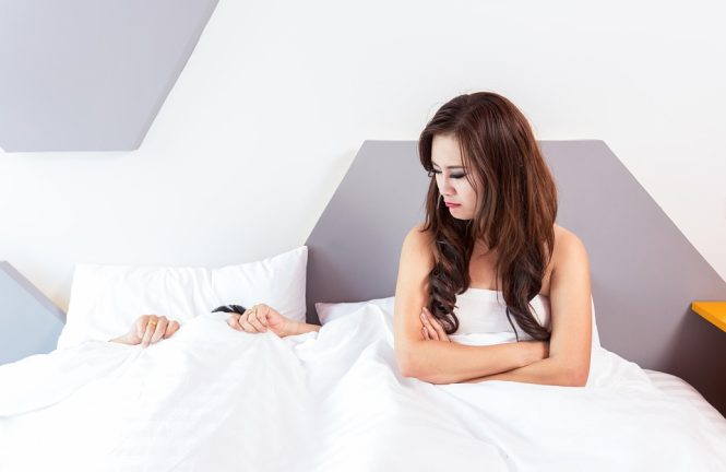
Sleep Tight: The Best Bedroom Paint Colors for a Restful Night’s Sleep
When it comes to getting a good night’s sleep, there are many factors to consider, from the comfort of your mattress to the darkness of your room. However, one often overlooked aspect is the color of your bedroom walls. The right paint color can promote relaxation, reduce stress, and even improve the quality of your sleep. In this article, we’ll explore the best bedroom paint colors for a restful night’s sleep.
The Science Behind Color and Sleep
Colors can have a profound impact on our mood, emotions, and even our physical well-being. Different colors can stimulate or calm our brains, affecting our ability to fall asleep and stay asleep. For example, warm colors like red and orange can increase alertness and energy, while cool colors like blue and green can promote relaxation and calmness.
Best Bedroom Paint Colors for Sleep
Based on color theory and sleep research, here are some of the best bedroom paint colors for a restful night’s sleep:
- Soft Blues: Blues are known for their calming effects, and soft blues like light sky blue or powder blue can create a peaceful atmosphere in the bedroom. These colors can help reduce stress and anxiety, making it easier to fall asleep.
- Muted Greens: Green is a balancing color that can promote relaxation and harmony. Muted greens like sage or moss can create a soothing ambiance in the bedroom, helping you unwind and prepare for sleep.
- Creamy Whites: Soft, creamy whites can create a sense of calmness and serenity in the bedroom. These colors can also help reflect light, making the room feel brighter and more airy.
- Pale Grays: Gray is a neutral color that can help reduce stress and anxiety. Pale grays like dove or mist can create a calming atmosphere in the bedroom, promoting relaxation and sleep.
- Warm Beiges: Beige is a warm, earthy color that can create a cozy and inviting atmosphere in the bedroom. Soft beiges like sand or taupe can help promote relaxation and sleep, especially when paired with natural textiles like wood or stone.
Colors to Avoid
While some colors can promote sleep, others can interfere with it. Here are some colors to avoid in the bedroom:
- Bright Reds: Red is a stimulating color that can increase alertness and energy, making it difficult to fall asleep.
- Electric Blues: Bright, electric blues can be overstimulating and interfere with sleep.
- Vibrant Yellows: Yellow is a happy, energetic color, but it can be too stimulating for the bedroom.
- Dark Browns: While brown can be a warm, cozy color, dark browns can make a room feel heavy and claustrophobic, interfering with sleep.
Tips for Choosing the Perfect Bedroom Paint Color
When choosing a paint color for your bedroom, consider the following tips:
- Consider the Natural Light: If your bedroom receives plenty of natural light, you may be able to get away with a bolder color. However, if your room is dimly lit, opt for a lighter color to reflect light and make the space feel brighter.
- Think About Your Personal Preferences: Choose a color that you find calming and relaxing. If you’re unsure, try testing out samples on your walls before committing to a specific color.
- Consider the Color Temperature: Cool colors like blue and green can promote relaxation, while warm colors like red and orange can stimulate energy.
- Don’t Forget About the 60-30-10 Rule: Divide your bedroom into 60% of a dominant color, 30% of a secondary color, and 10% of an accent color. This can help create a balanced and harmonious space.
Conclusion
The right paint color can make all the difference in creating a restful and relaxing bedroom. By choosing a color that promotes calmness and serenity, you can improve the quality of your sleep and wake up feeling refreshed and rejuvenated. Remember to consider your personal preferences, the natural light in your room, and the color temperature when selecting a paint color. With a little experimentation and patience, you can find the perfect color to help you sleep tight.