
Eliminating decor clashes is a common struggle for homeowners looking to create aesthetically pleasing and functional living spaces. A room filled with mismatched colors, patterns, and textures can quickly feel cluttered and overwhelming, detracting from the overall ambiance. This guide delves into practical strategies for achieving a visually harmonious and balanced interior decor. This article will cover a comprehensive approach, from understanding color palettes and patterns to arranging furniture effectively. We’ll discuss the underlying principles and highlight common mistakes to avoid, offering concrete examples and tips to inspire your home décor project.
Understanding the Causes of Decor Clashes
Color Conflicts
Color is a powerful design element. Incorrect color combinations can lead to a chaotic and jarring visual experience. The wrong shade or saturation can disrupt the visual balance of the room. For example, combining a vibrant, bold shade with several pastel shades can create a mismatch, especially if these colors aren’t related in the color wheel. Understanding color theory and its principles will help you choose balanced and harmonizing color palettes for your home.
Pattern Overload
Too many patterns in a single room can overwhelm the eye. Mix and match patterns cautiously to prevent a visually chaotic look. Think of contrasting patterns in a room with similar shades, or use a variety of scale to avoid an overwhelming aesthetic. Combining bold patterns requires an understanding of proportion and harmony to create a visually appealing space.
Texture Contrasts
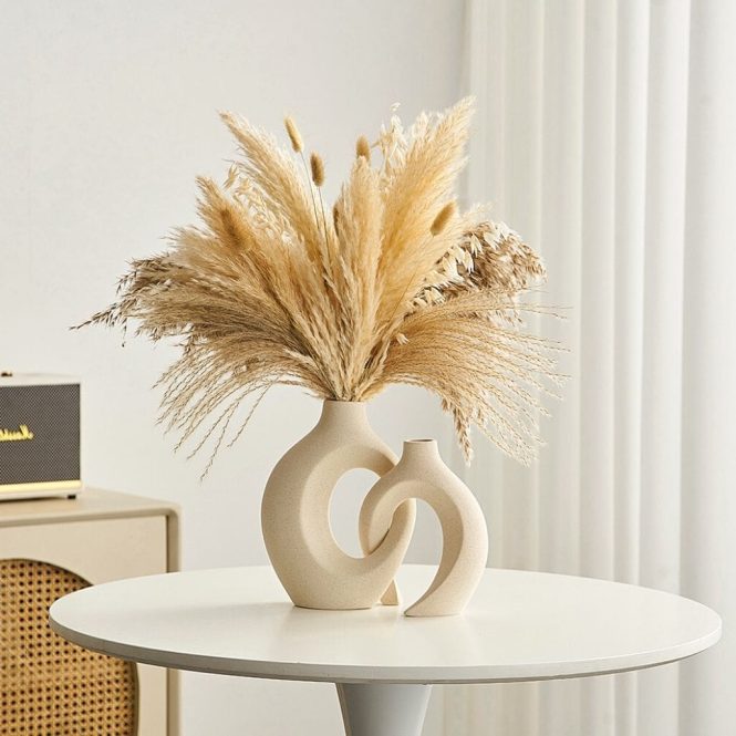
Combining contrasting textures can also be a source of decor clashes. A sleek, modern piece of furniture might feel out of place next to a rustic, textured piece. Consider the overall harmony of textures in the room and aim to create a cohesive and balanced aesthetic.
Harmonizing Color Palettes
The Power of Color Theory
Understanding color theory is fundamental in achieving visual harmony. Using a color wheel and understanding the relationships between colors can help you create a balanced color palette that enhances the overall aesthetic of the room. Analogous colors (colors next to each other on the color wheel) create a serene and harmonious mood. Complementary colors (colors opposite each other on the color wheel) can offer a vibrant contrast.
Creating a Cohesive Palette
Once you grasp color theory, you can start creating a cohesive color palette for each room. Consider the mood you want to evoke in each space. A calming living room might feature a cool color palette, while a vibrant kitchen might leverage a warm color palette. Use these color schemes as a framework and layer tones and shades to create a visually appealing design.
Mastering Pattern Mixing
Mixing Patterns with Caution
Mixing patterns can create a visually interesting look, but too many patterns can appear chaotic. Select no more than three patterns in a single room, ensuring that they complement each other in terms of size, scale, and color. For example, a bold floral wallpaper paired with a subtle geometric rug and a striped sofa can create a beautiful balance of patterns.
Scale and Proportion in Pattern Mixing
Consider the scale and proportion of the patterns you choose. Large-scale patterns should be used sparingly and balanced with smaller-scale patterns for visual balance. If you use small-scale patterns in several areas, a bold large-scale pattern can create an appealing contrast. For example, a patterned rug with small scale paired with a large-scale patterned throw pillow can work nicely, but always ensure that the room does not look overwhelming.
Arranging Furniture for Visual Harmony
Balance and Symmetry
Achieving balance and symmetry in furniture arrangements can help create a sense of visual harmony. For instance, placing symmetrical furniture arrangements, such as identical sofas and side tables on opposite sides of a room, can create a visually appealing and balanced aesthetic. This balanced arrangement promotes a serene and organized mood.
Visual Flow and Space
Ensure furniture arrangements allow for visual flow and adequate space for movement within the room. Avoid overly congested areas, as this will disrupt visual harmony and create a feeling of chaos. Clear pathways and ample space ensure that the room doesn’t appear cluttered or cramped. Consider furniture spacing, particularly in areas where people regularly move.
Incorporating Texture for Depth
Choosing Complementary Textures
Different textures add depth and dimension to a space, but be careful not to overuse textures that are too contrasting. Combining different textures carefully allows you to create visual interest without overwhelming the space. For example, a plush velvet sofa can be complemented by a linen throw blanket and jute rug.
Incorporating Texture for visual interest
Textures, such as wood, stone, and woven materials, can be used to bring warmth and visual interest to a room. Use textures to create a sense of harmony and continuity in the room and avoid textures that are too contrasting. For example, a smooth glass table paired with a rough, textured carpet might create a clash.
Frequently Asked Questions
How do I choose a color palette for a room with multiple existing items?
Consider the existing colors in the room and choose colors that complement or contrast with them. Analyze the existing colors to decide whether you want to complement them with analogous colors or create visual impact with complementary colors. For instance, if your room already has blue accents, choose analogous colors in the color wheel for the other decor and design elements in the room. This approach will lead to a harmonized color scheme that works with your existing decor. If you want to create a vibrant room with existing elements, consider using complementary colors to create contrast.
What are some tips for preventing pattern clashes?
To avoid pattern clashes, carefully select patterns with colors and shapes that complement each other. Choose patterns that have a similar scale. For instance, if your room has a large patterned area rug, choose smaller-scaled patterns for your other decor, such as cushions. The use of similar color palettes, such as warm or cool tones, is recommended. Also, avoid using more than three patterns in one room. Stick to patterns that have matching colors or a similar style. Consider mixing and matching textures instead of just focusing on mixing patterns.
In conclusion, eliminating decor clashes is a crucial step toward creating a harmonious and visually appealing home environment. By understanding the elements contributing to these clashes, such as color palettes, patterns, and textures, and implementing the strategies discussed, you can effectively curate a space that reflects your personal style and enhances your overall well-being. Remember to prioritize balance, consider your personal style, and embrace the journey of creating a beautiful and clutter-free home. Don’t hesitate to consult with design professionals or explore online resources for further inspiration. Contact us today for a free consultation!