Color Your World: The Impact of Bedroom Paint on Mood and Sleep
When it comes to designing our bedrooms, we often focus on the furniture, decor, and lighting. However, one crucial element that can greatly impact our mood and sleep is the color of our bedroom walls. The paint color we choose can have a profound effect on our emotional state and the quality of our sleep. In this article, we’ll explore the impact of bedroom paint on mood and sleep, and provide tips on how to choose the perfect color for a restful and rejuvenating bedroom.
The Psychology of Color
Colors can evoke different emotions and psychological responses in humans. Warm colors like red, orange, and yellow can stimulate our minds and bodies, increasing energy and alertness. On the other hand, cool colors like blue, green, and purple can calm our minds and promote relaxation. When it comes to the bedroom, it’s essential to choose a color that promotes relaxation and serenity.
The Impact of Color on Mood
The color of our bedroom walls can significantly impact our mood. A study by the National Sleep Foundation found that people who sleep in bedrooms with calming colors like blue or green tend to have better sleep quality and duration. In contrast, bold and bright colors like red or orange can increase alertness and make it difficult to fall asleep.
Here are some popular bedroom paint colors and their effects on mood:
- Light Blue: Promotes feelings of calmness and serenity, perfect for a relaxing bedroom.
- Pale Green: Creates a sense of balance and harmony, ideal for a peaceful retreat.
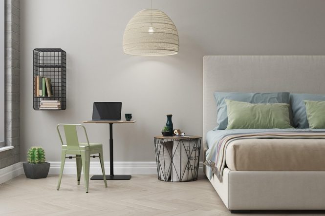
- Soft Gray: Provides a neutral and soothing atmosphere, great for a modern bedroom.
- Warm Beige: Evokes feelings of comfort and coziness, perfect for a traditional bedroom.
The Impact of Color on Sleep
The color of our bedroom walls can also affect the quality of our sleep. A dark or bold color can make our bedroom feel smaller and more claustrophobic, leading to poor sleep quality. On the other hand, a light and calming color can create a sense of spaciousness and promote better sleep.
Here are some tips for choosing a bedroom paint color that promotes good sleep:
- Avoid bold and bright colors: Colors like red, orange, and yellow can increase alertness and make it difficult to fall asleep.
- Choose light and calming colors: Colors like light blue, pale green, and soft gray can promote relaxation and improve sleep quality.
- Consider the 60-30-10 rule: Divide your bedroom into 60% of a dominant color, 30% of a secondary color, and 10% of an accent color. This can create a harmonious and balanced atmosphere that promotes good sleep.
Tips for Choosing the Perfect Bedroom Paint Color
Choosing the perfect bedroom paint color can be overwhelming, especially with the countless options available. Here are some tips to help you make the right choice:
- Consider your personal preferences: Think about the colors you love and how they make you feel.
- Think about the natural light: If your bedroom receives plenty of natural light, you may be able to get away with a bolder color. However, if your bedroom is dimly lit, it’s best to stick with lighter colors.
- Test the color: Paint a small sample of the color on your wall and observe how it looks at different times of the day.
- Don’t forget about the ceiling: A light-colored ceiling can make your bedroom feel more spacious and promote better sleep.
Conclusion
The color of our bedroom walls can have a significant impact on our mood and sleep. By choosing a calming and soothing color, we can create a peaceful retreat that promotes relaxation and rejuvenation. Remember to consider your personal preferences, the natural light, and the 60-30-10 rule when selecting a bedroom paint color. With a little experimentation and patience, you can find the perfect color to color your world and improve the quality of your sleep.